
Educational Ecosystem
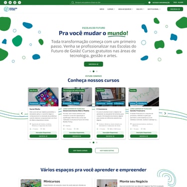
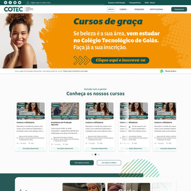
Schools of the Future of Goiás and Technological Colleges of Goiás (EFG and COTEC)
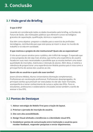
The project consists of creating 2 responsive websites integrated with the Course Management System (SGC) whose main objective is to provide free technological courses for the most vulnerable population of Goiás and thus promote social transformation through education, employment and income.
1. Overview
I was responsible for all stages of research and visual definition of the product with the first style guide and layouts for EFG, which, due to their great similarity, also served as a basis for COTEC. After that, I was promoted to Design Lead and the ones who took over the project were my lead designers Regina Helena and Bruno Henrique. After that, I began to guide them, monitor their progress on a daily basis and assist in making strategic decisions internally and with other stakeholders.
My Role
Problem
Objectives
Results
Low conversion of registrants into enrolled students.
High abandonment rate of the registration form.
High rate of errors when filling out the form.
Rigid and unintuitive navigation.
Overburdened school staff to overcome systemic failures.
Challenging visuals that are not in line with the visual identity and purpose of the brands.
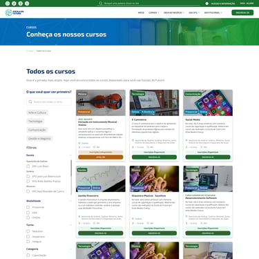
Improve the information architecture of websites.
Work together with the communications and teaching departments to define the best strategies.
Facilitate and shorten the registration process to capture leads, reduce abandonment and errors.
Provide an excellent mobile experience.
Update the look of websites, improving visual identities and making them suitable to current standards.
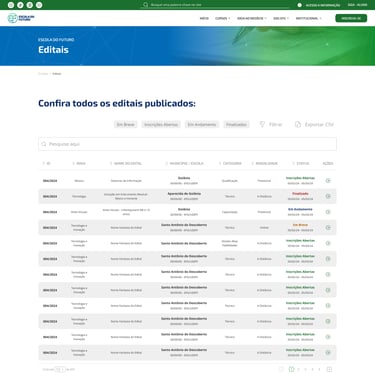
33% reduction in the number of clicks needed to access the main pages of notices and courses.
The registration form reduced its steps by 50%, going from 12 to 6.
Using good UX practices, the form can prevent errors and keep the user aware of their steps at each stage, as verified in usability tests with real students.
The websites now have an attractive look and a strong identity, becoming competitive with similar ones from the private sector.
2. Process
2.1. Research and Analysis
Current Content and Navigation Map
Briefing
Benchmarking
Personas
User Journey
Ideal Content and Navigation Map
Final Presentation
Wireframes
Layout and Prototypes
Design System/Style Guide
Final Prototype
2.2. Creation
Handoff
Development support
Analytics
2.3. Closure
Navigation Map and Current Content
The starting point for the project was to understand the website and the brand as a whole. A map was created with all the pages and their respective contents that existed in the current version of the site. This enabled a more holistic view of the project that would be carried out in the future.
"A heuristic and accessibility analysis were considered, but the poor performance of the site was quite evident and as it was a latent pain for users, I chose to focus on studies that could provide us with new perspectives. Another relevant point is that the project lacked statistical data, the analytics it had had not been properly configured and was too poor to infer any different view."
Designer's Notes
2.1. Research and Analysis
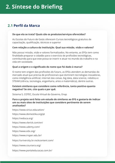
A questionnaire was prepared with general questions about the Escolas do Futuro brand for the project's main stakeholder, which in the private sector would be equivalent to the client, SECTI (Secretariat of Science, Technology, Innovation and Professional Education). Based on the responses obtained, it was possible to obtain a broad view of the stakeholder regarding the brand's positioning and the vision for the educational institution's website. Finally, it was converted into a report with a general summary of the responses obtained and forwarded for validation with SECTI.
Briefing
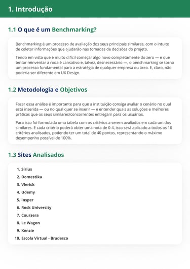
Benchmarking
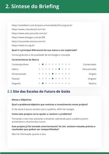
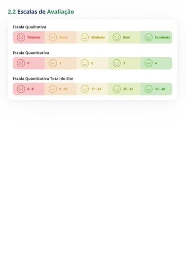
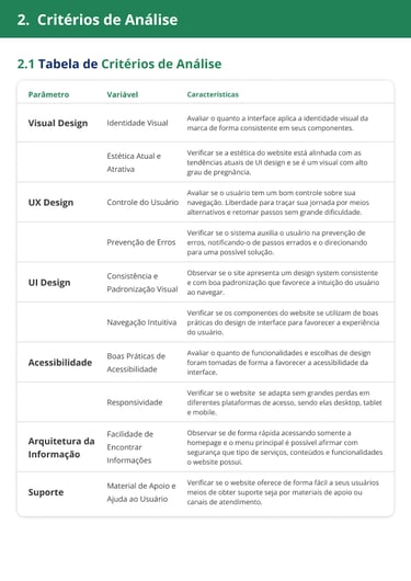
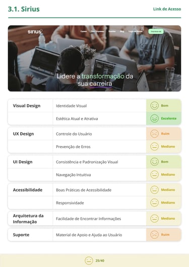
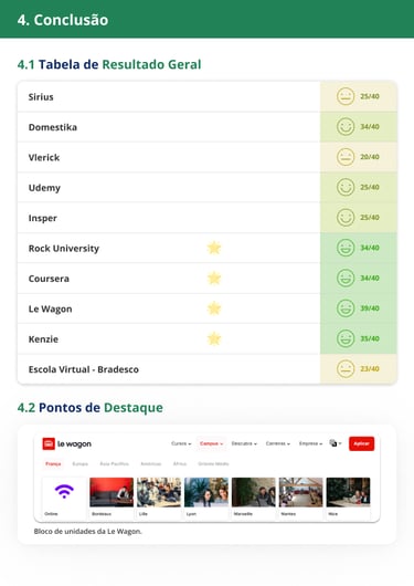
Based on the answers obtained from the briefing, which contained a specific question about similar websites, a benchmarking process was initiated. A total of 10 websites in the education niche focused on technologies, arts and online teaching were analyzed. Some criteria were established for the analysis, such as: Visual Design, UX Design, UI Design, Accessibility, Information Architecture, and Support. The entire study can be found at the end of the section.
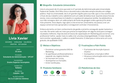
Personas
With greater progress in the previous stages, it was possible to begin developing the project's personas. This was the most challenging stage of the research because it was perceived as a point that was unclear to the stakeholders, who often did not reach agreements among themselves. After some reworks and adjustments, we reached the conclusion with 5 personas with different profiles that are the target audience of the Schools of the Future of Goiás.
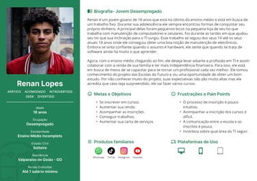
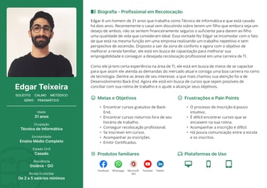
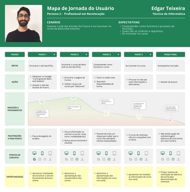
Based on the objectives and contexts of each persona, I mapped out a route for 3 of the 5 developed. 2 routes had an unfortunate ending due to system experience failures and one was successful due to the high engagement and availability of that user profile. This study also revealed the need for a more consistent communication plan for capturing leads and generated movement within the communications department.
User Journey
Navigation Map and New Content
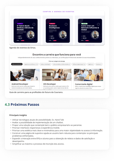
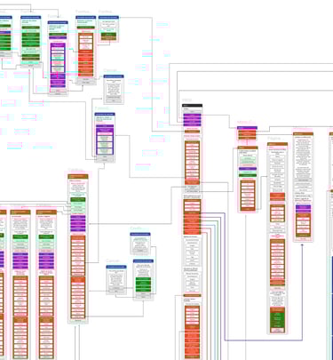
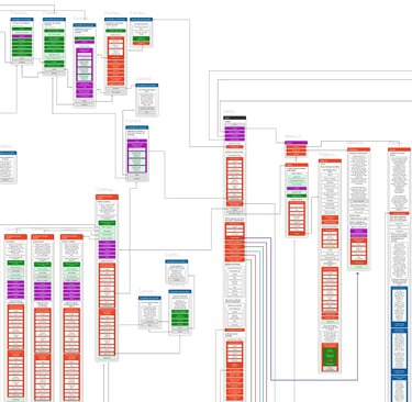
As the final step of this macro analysis and research, I started to create a site map of what would be an ideal user experience, taking into account all the pain points and opportunities for improvement in each of the steps. The result was a 4x increase in the number of screens, but this was later reviewed with the communications department during internal validation, as there would not be enough resources to feed and produce content within the expected time.
Final presentation to SECTI (Secretariat of State for Science, Technology and Innovation)
As a closing rite of passage for the research phase, I and other colleagues from the communications and projects departments went on to give a presentation to SECTI in order to obtain final validation of the information architecture we were proposing for the new EFG website. The presentation I gave can be seen below.
2.2. Creation
Wireframes
In order to have a brief overview of the information architecture, some wireframes were created to get a general idea, mainly of the home page, and this material was only validated internally.
Layout and Prototypes
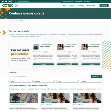
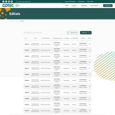
Starting with the wireframes, I started the layout of the homepage, which tends to be the heart of a project, since it is in this first layout that the main visual style decisions are made. Once the first screen was designed, it was validated internally without reservations, and then I moved on to the others. I structured the delivery of these screens in parts to facilitate the approval process and make it more dynamic and collaborative. In total, there were 5 parts, each taking around 15 days.
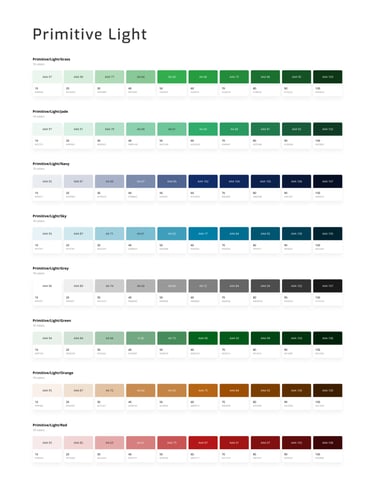
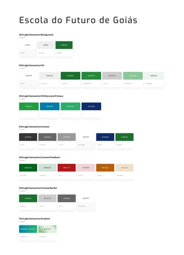
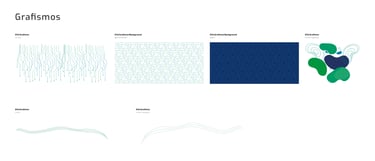
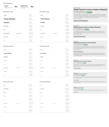
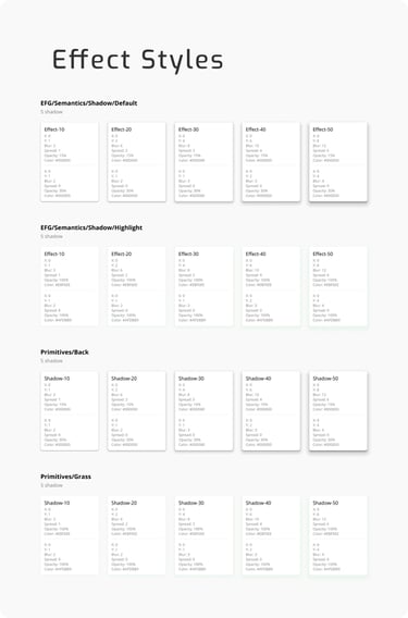
Design System and Style Guide
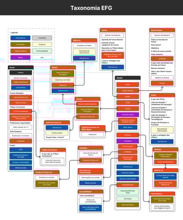
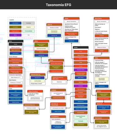
Along with the development of the layouts, I was creating the website's Style Guide and also the Design System that would later also be used in the Course Management System for the EFGs.
Final Prototypes
2.3. Closure
Handoff
Having internal and external approval (SECTI), the project was forwarded to the development team via Figma.
Development Support
After the handoff, the design team began to monitor and support the developers in building the website, answering questions, performing design reviews and assisting with possible integrations.
Analytics
After closing, the design team was responsible for directly assisting the communications team in building efficient analytics with data that will enable monitoring and many future insights.