

Electoral Data Panel
Keeping an Eye on the Polls
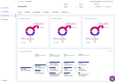
The project consists of creating a Power BI dashboard that provides a visualization of data collected by UFG (Federal University of Goiás) from city council elections in the country's main capitals. The project focuses on studying and combating gender inequality in politics. The result can be seen at the link below: deolhonasurnas.ufg.br/propaganda-eleitoral-2024-painel/
1. Overview
I was responsible for the information architecture, visual design and prototyping of the dashboard. It was a short-term job (1 month) carried out together with the data analyst who developed the dashboard, Breno Augusto.
My Role
Problem
Objectives
Results
Lots of data collected without any processing.
Researchers need ways to visualize this data in order to study it.
Need for an intuitive and easy-to-navigate dashboard.
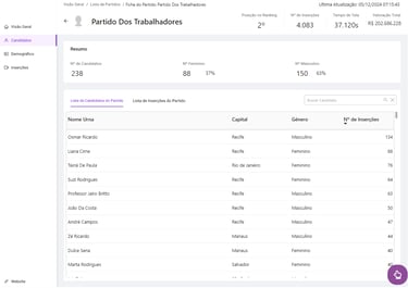
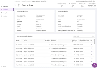
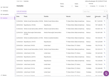
Create a dashboard that allows you to view data at different levels of granularity
Allow you to cross-reference a wide range of data.
Build a dashboard with a clean look and simple navigation.
Positive feedback from the entire research team.
Dashboard published and made available for access by the entire population.
Architecture proposal praised for its efficiency and ability to extract inferences from data.
2. Process
2.1. Definition
Information Architecture
Layout and Prototypes
2.2. Creation
2.3. Closure
Information Architecture
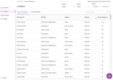
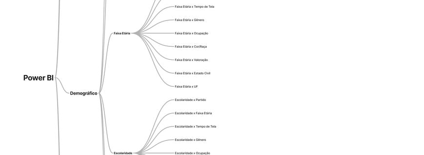
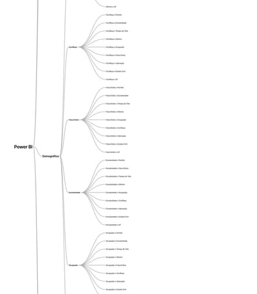
The project kicked off with an understanding of the profile of the data we would be working with. First, we had access to a spreadsheet from one day of collection so that we could get an idea of the information we had. From there, I cleaned up all the columns in the spreadsheet and worked with the Figjam tool to come up with a hierarchy and organization. Below is an initial model for organizing the content; click for more details.
2.1. Definition
2.2. Creation
Layout and Prototypes
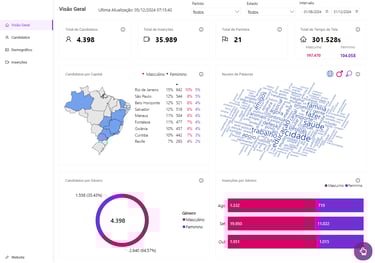
For this project, due to the current deadline, I chose to work with an open source design system called Ant Design. From its library, I created the first dashboard structure and customized the styles to fit the De Olho nas Urnas brand.


2.3. Closure
Handoff
Having internal approval, the project was forwarded to the BI construction team via Figma.